Reframing the Intranet
Reframing the Intranet
Reframing the Intranet
Role: Design Lead & UX Designer |· Focus: Information Architecture, Usability, Strategy
Role: Design Lead & UX Designer
Role: Design Lead & UX Designer |· Focus: Information Architecture, Usability, Strategy
Shifting from visual redesign to structural clarity, aligning content with how users think & behave
Shifting from visual redesign to structural clarity, aligning content with how users think & behave
Shifting from visual redesign to structural clarity, aligning content with how users think & behave
Project Overview
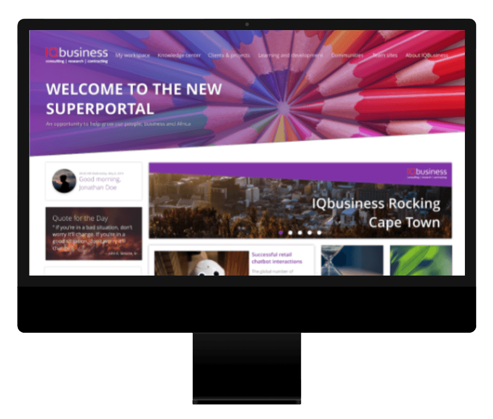
I was asked to lead a team of designers to revamp the internal Intranet portal, addressing low adoption, poor usability, and fragmented content. The goal was to transform it into a more structured, user-centred experience aligned with both employee needs and business goals.
The existing portal was cluttered, difficult to navigate, and largely underutilised, limiting its effectiveness as a central hub for information and communication.
While the initial brief focused on redesigning the interface, it quickly became clear that the core issue was structural. Users struggled to find information, navigate content, and understand where key resources lived, this highlighted the mismatch between the system’s structure and users’ mental models.
Content had also grown organically over time without clear governance, leading to duplication, inconsistent labeling, and a lack of clear information hierarchy.
I was asked to lead a team of designers to revamp the internal Intranet portal, addressing low adoption, poor usability, and fragmented content. The goal was to transform it into a more structured, user-centred experience aligned with both employee needs and business goals.
The existing portal was cluttered, difficult to navigate, and largely underutilised, limiting its effectiveness as a central hub for information and communication.
While the initial brief focused on redesigning the interface, it quickly became clear that the core issue was structural. Users struggled to find information, navigate content, and understand where key resources lived, this highlighted the mismatch between the system’s structure and users’ mental models.
Content had also grown organically over time without clear governance, leading to duplication, inconsistent labeling, and a lack of clear information hierarchy.
I was asked to lead a team of designers to revamp the internal Intranet portal, addressing low adoption, poor usability, and fragmented content. The goal was to transform it into a more structured, user-centred experience aligned with both employee needs and business goals.
The existing portal was cluttered, difficult to navigate, and largely underutilised, limiting its effectiveness as a central hub for information and communication.
While the initial brief focused on redesigning the interface, it quickly became clear that the core issue was structural. Users struggled to find information, navigate content, and understand where key resources lived, this highlighted the mismatch between the system’s structure and users’ mental models.
Content had also grown organically over time without clear governance, leading to duplication, inconsistent labeling, and a lack of clear information hierarchy.
Project Overview
I was asked to lead a team of designers to revamp the internal Intranet portal, addressing low adoption, poor usability, and fragmented content. The goal was to transform it into a more structured, user-centred experience aligned with both employee needs and business goals.
The existing portal was cluttered, difficult to navigate, and largely underutilised, limiting its effectiveness as a central hub for information and communication.
While the initial brief focused on redesigning the interface, it quickly became clear that the core issue was structural. Users struggled to find information, navigate content, and understand where key resources lived, this highlighted the mismatch between the system’s structure and users’ mental models.
Content had also grown organically over time without clear governance, leading to duplication, inconsistent labeling, and a lack of clear information hierarchy.

My Role
My Role
I led the UX approach and design direction for the project, working closely with stakeholders and the broader design team.
My responsibilities included:
Framing the problem and defining the experience strategy
Facilitating research and synthesising insights
Guiding IA and interaction design decisions
Leading concept development and validation
Ensuring alignment between user needs and business priorities
I led the UX approach and design direction for the project, working closely with stakeholders and the broader design team.
My responsibilities included:
Framing the problem and defining the experience strategy
Facilitating research and synthesising insights
Guiding IA and interaction design decisions
Leading concept development and validation
Ensuring alignment between user needs and business priorities
My Approach
My Approach
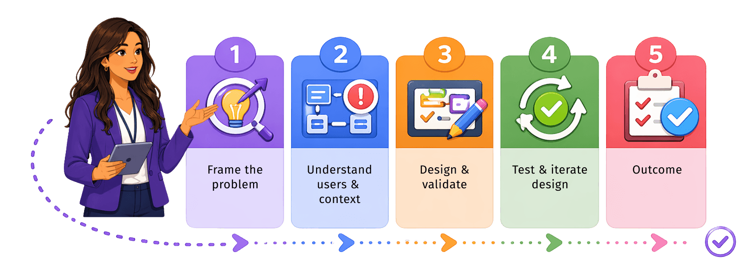
Rather than treating this as a visual redesign, we approached it as a structural and experience challenge. The focus was on understanding user needs and behaviours, redefining the information architecture, and validating decisions early through testing.
Rather than treating this as a visual redesign, we approached it as a structural and experience challenge.
The focus was on understanding user needs and behaviours, redefining the information architecture, and validating decisions early through testing.
Rather than treating this as a visual redesign, we approached it as a structural and experience challenge. The focus was on understanding user needs and behaviours, redefining the information architecture, and validating decisions early through testing.
Framing the problem and approach
Framing the problem and approach
Before moving into research and design, we aligned on the problem space, scope, and key objectives.
While the initial brief focused on redesigning the interface, we identified early on that the real challenge was structural — how content was organised, accessed, and maintained over time.
This ensured the team was focused on solving the underlying issues rather than applying surface-level improvements.
Before moving into research and design, we aligned on the problem space, scope, and key objectives.
While the initial brief focused on redesigning the interface, we identified early on that the real challenge was structural — how content was organised, accessed, and maintained over time.This ensured the team was focused on solving the underlying issues rather than applying surface-level improvements.
Before moving into research and design, we aligned on the problem space, scope, and key objectives.
While the initial brief focused on redesigning the interface, we identified early on that the real challenge was structural — how content was organised, accessed, and maintained over time. This ensured the team was focused on solving the underlying issues rather than applying surface-level improvements.
Before moving into research and design, we aligned on the problem space, scope, and key objectives.
While the initial brief focused on redesigning the interface, we identified early on that the real challenge was structural — how content was organised, accessed, and maintained over time.
This ensured the team was focused on solving the underlying issues rather than applying surface-level improvements.
Understanding users, business, and context
Understanding users & business
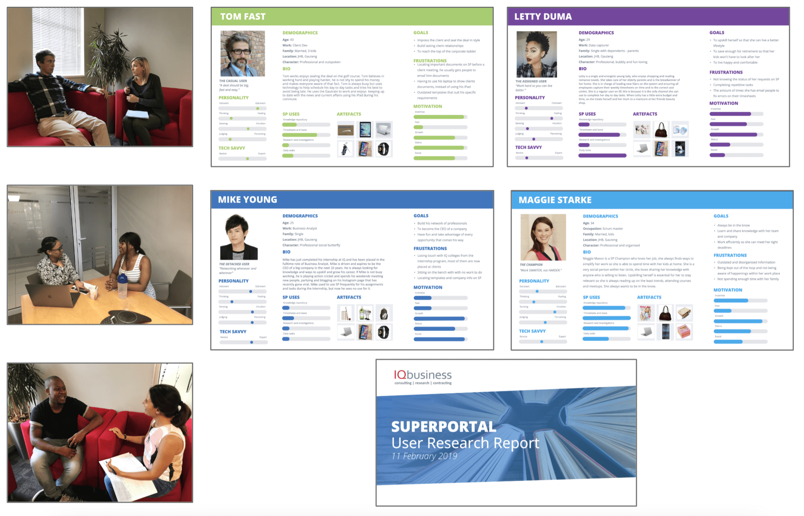
We built a shared understanding of the business, users, and existing system through stakeholder and user interviews.
These conversations uncovered key pain points, behaviours, and expectations, highlighting gaps between how content was structured and how users actually navigate and search for information.
Insights were synthesised into proto-personas to guide decision-making and keep the team aligned with real user needs.
We built a shared understanding of the business, users, and existing system through stakeholder and user interviews.
These conversations uncovered key pain points, behaviours, and expectations, highlighting gaps between how content was structured and how users actually navigate and search for information.
Insights were synthesised into proto-personas to guide decision-making and keep the team aligned with real user needs.
We built a shared understanding of the business, users, and existing system through stakeholder and user interviews.
These conversations uncovered key pain points, behaviours, and expectations, highlighting gaps between how content was structured and how users actually navigate and search for information.
Insights were synthesised into proto-personas to guide decision-making and keep the team aligned with real user needs.
Redefining the information architecture
Redefining IA
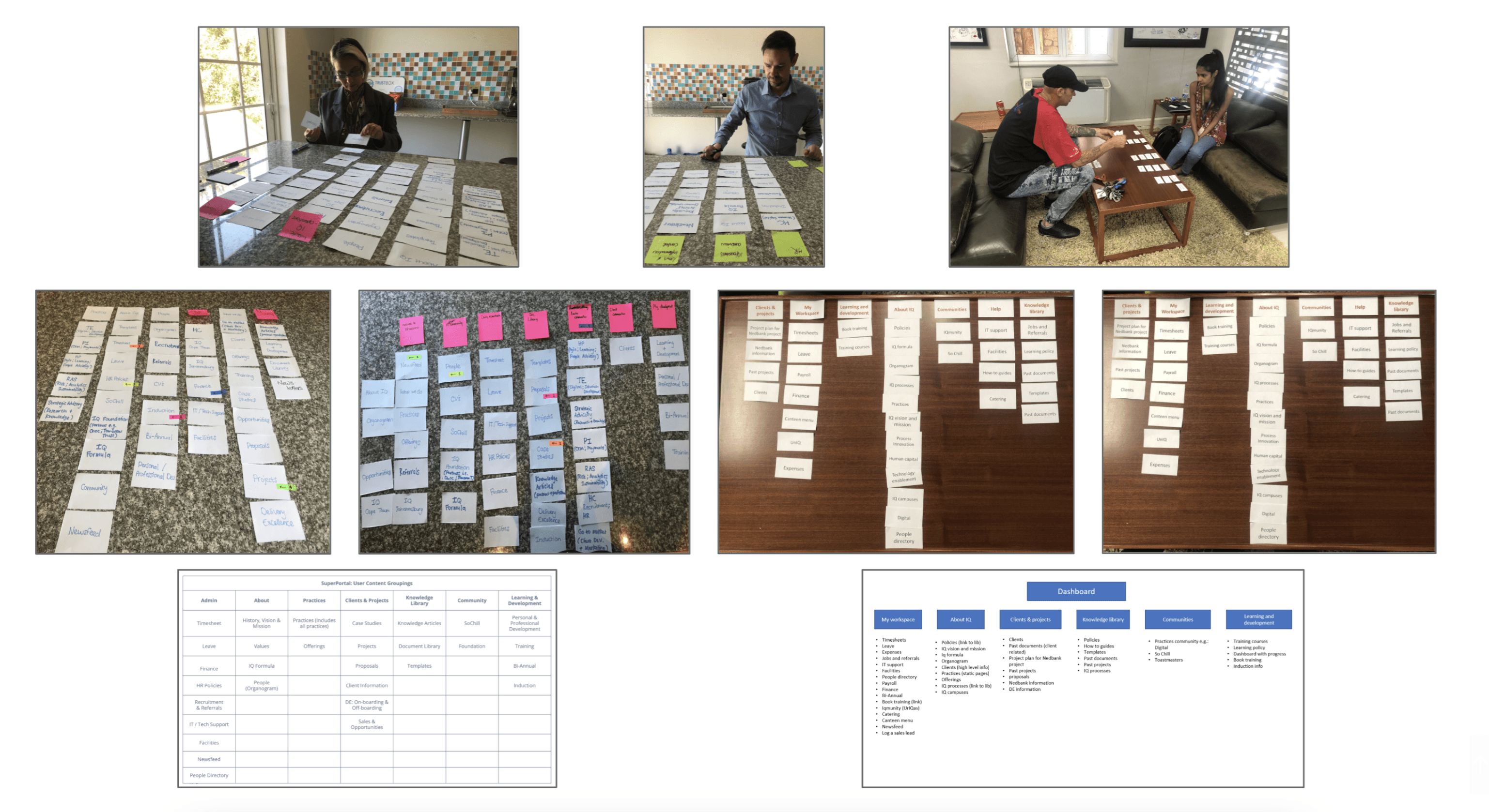
A core focus of the project was restructuring the information architecture to better align with user mental models. We used card sorting to test and refine categories, terminology, and content groupings, ensuring the structure reflected how users naturally organise and find information.
This formed the foundation for a clearer, more intuitive navigation system.
A core focus of the project was restructuring the information architecture to better align with user mental models. We used card sorting to test and refine categories, terminology, and content groupings, ensuring the structure reflected how users naturally organise and find information.
This formed the foundation for a clearer, more intuitive navigation system.
Designing and validating early
Designing and validating early
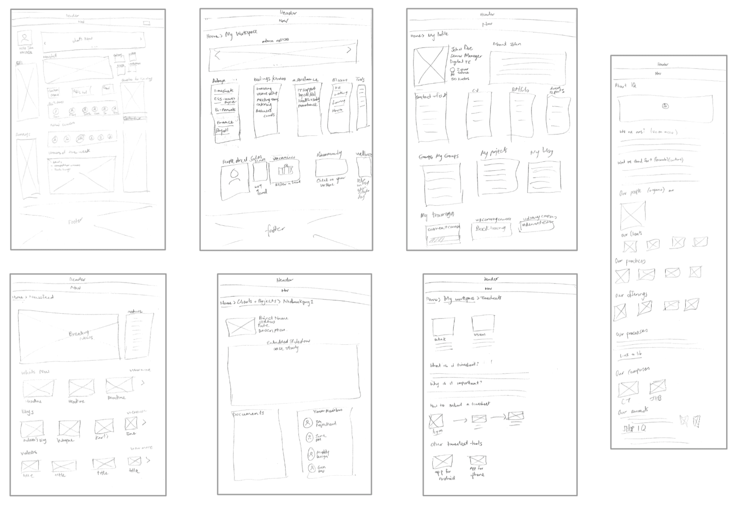
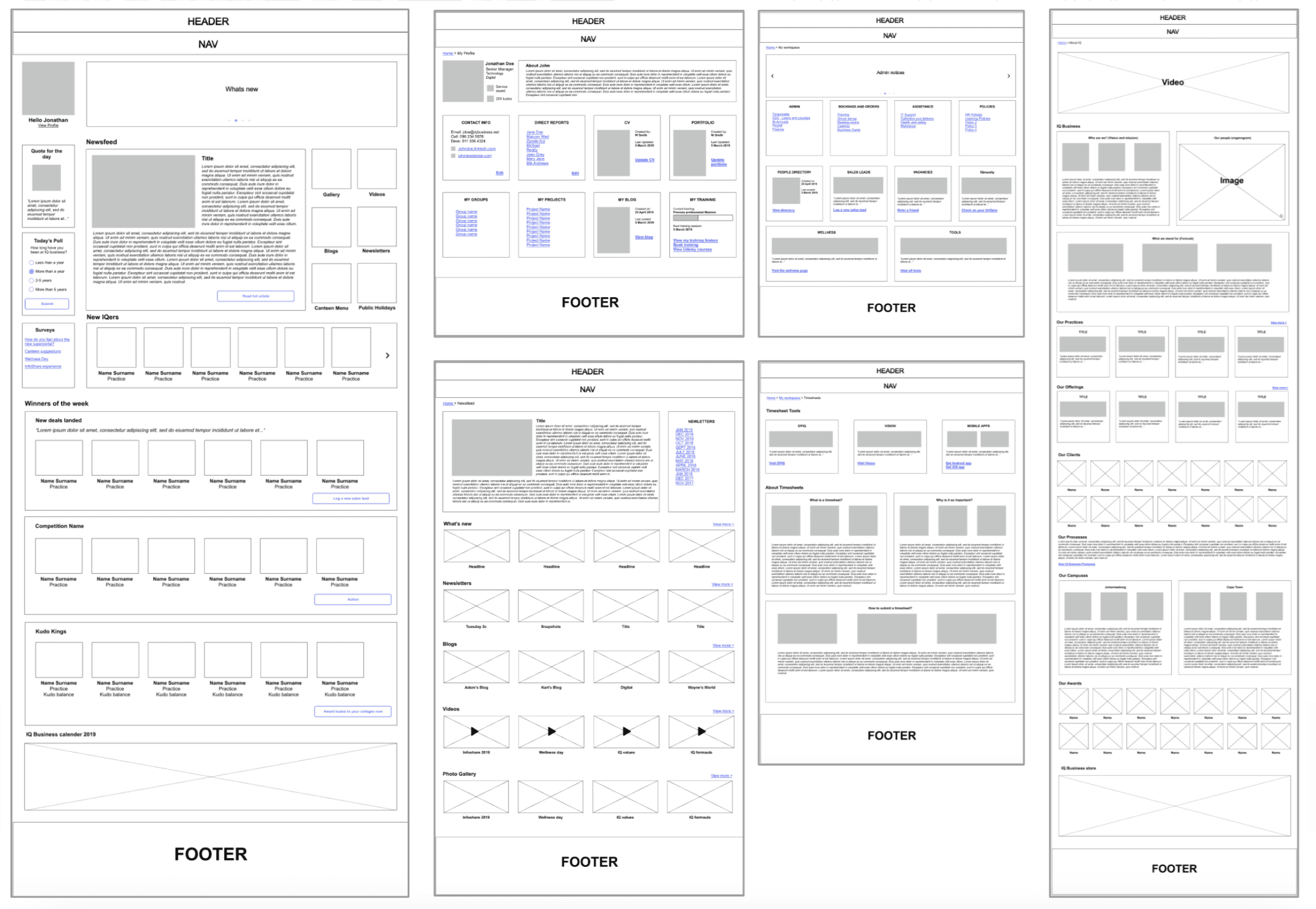
We worked iteratively, moving from brainstorming and sketching into wireframing and prototyping early in the process to explore and test concepts.
Ideas were developed through user flows and translated into interactive prototypes, allowing us to quickly validate assumptions and refine the experience based on real user feedback.
We worked iteratively, moving from brainstorming and sketching into wireframing and prototyping early in the process to explore and test concepts.
Ideas were developed through user flows and translated into interactive prototypes, allowing us to quickly validate assumptions and refine the experience based on real user feedback.
We worked iteratively, moving from brainstorming and sketching into wireframing and prototyping early in the process to explore and test concepts.
Ideas were developed through user flows and translated into interactive prototypes, allowing us to quickly validate assumptions and refine the experience based on real user feedback.
Iterating based on usability insights
Iterating based on usability insights
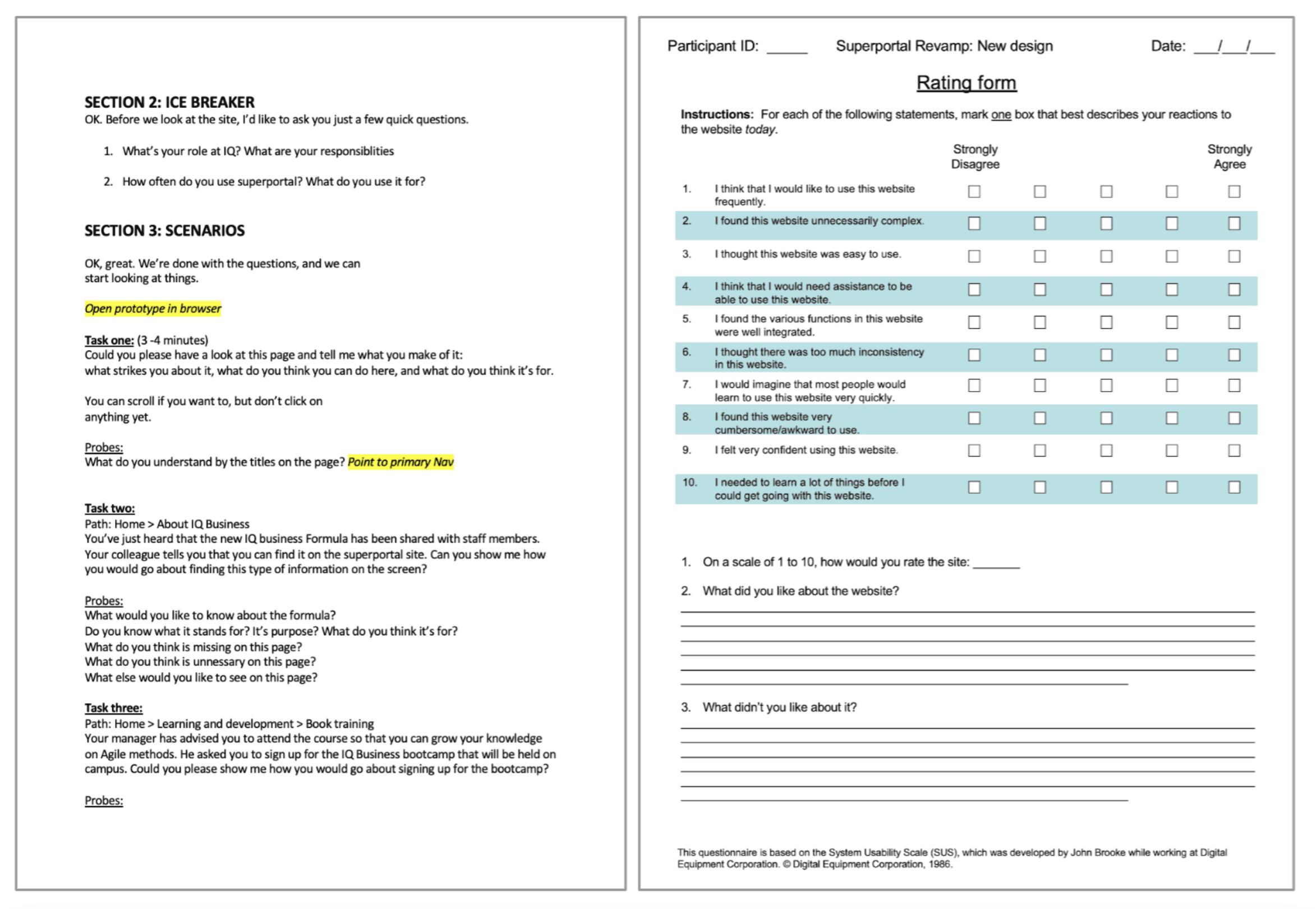
Usability testing was conducted using task-based scenarios and SUS ratings to evaluate how effectively users could navigate and complete key actions. Insights from these sessions informed iterative design updates, improving clarity, navigation, and overall usability.
This ensured the final solution was grounded in validated user behaviour, enabling users to more efficiently find and access the information they need in their day-to-day work.
Usability testing was conducted using task-based scenarios and SUS ratings to evaluate how effectively users could navigate and complete key actions. Insights from these sessions informed iterative design updates, improving clarity, navigation, and overall usability.
This ensured the final solution was grounded in validated user behaviour, enabling users to more efficiently find and access the information they need in their day-to-day work.
Outcome
Outcome
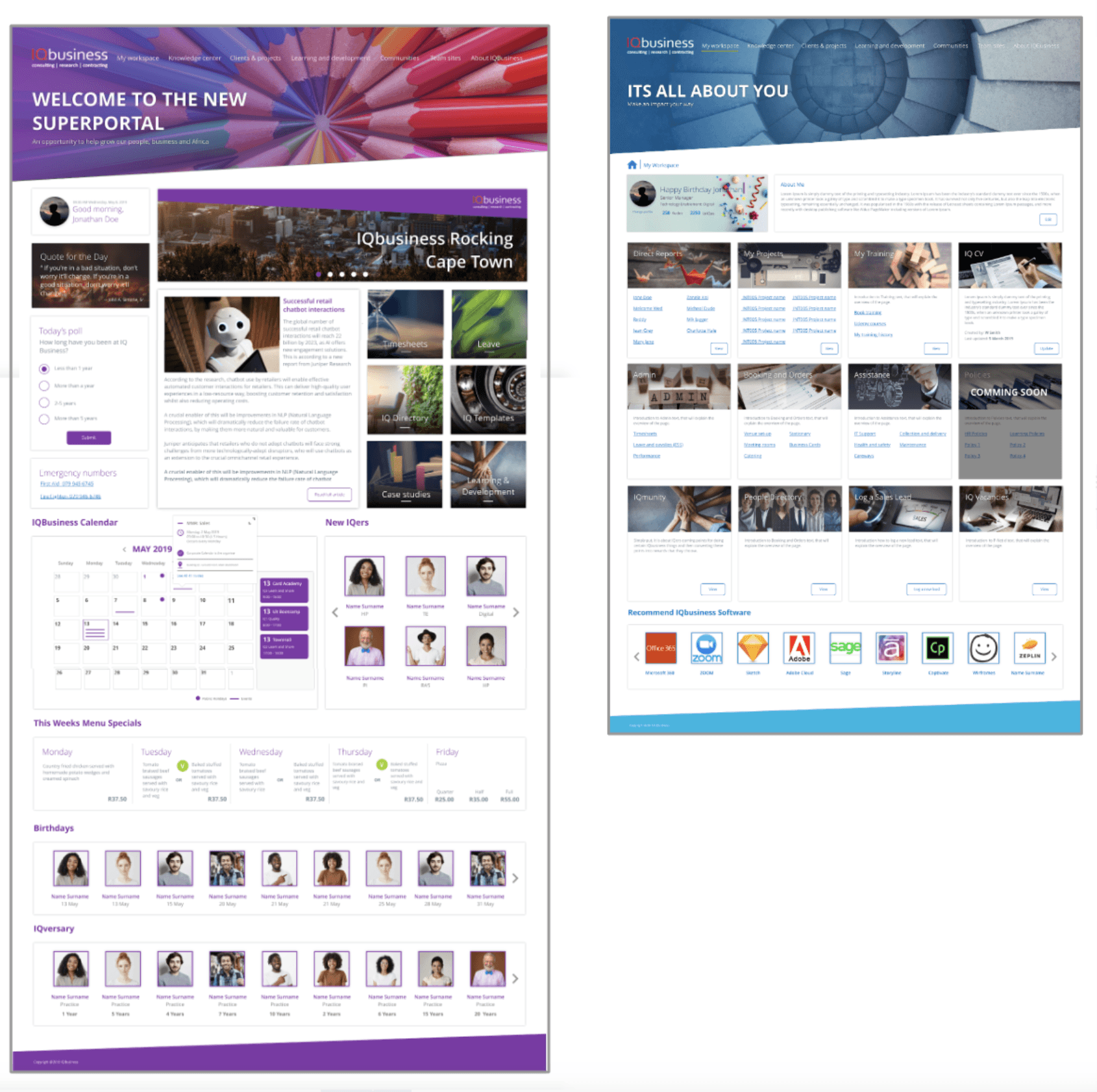
The redesign delivered a more structured and intuitive Intranet experience, making it easier for users to navigate, find, and access information. By aligning the information architecture with user mental models, the solution reduced complexity and improved clarity across key journeys.
From a business perspective, it also established a more scalable and maintainable content structure, providing a stronger foundation for future growth and ongoing content governance.
🧠 Reflection:
This project reinforced the importance of addressing underlying structural challenges rather than focusing purely on interface improvements.
It highlighted how critical it is to align information architecture with user mental models, particularly in content-heavy environments where navigation and findability are key to usability. Looking back, introducing content governance earlier in the process could have further strengthened the long-term sustainability of the solution.
The redesign delivered a more structured and intuitive Intranet experience, making it easier for users to navigate, find, and access information. By aligning the information architecture with user mental models, the solution reduced complexity and improved clarity across key journeys.
From a business perspective, it also established a more scalable and maintainable content structure, providing a stronger foundation for future growth and ongoing content governance.
🧠 Reflection:
This project reinforced the importance of addressing underlying structural challenges rather than focusing purely on interface improvements.
It highlighted how critical it is to align information architecture with user mental models, particularly in content-heavy environments where navigation and findability are key to usability. Looking back, introducing content governance earlier in the process could have further strengthened the long-term sustainability of the solution.